Vanguard Charitable: Redefining Investment Behaviour
INTRODUCTION
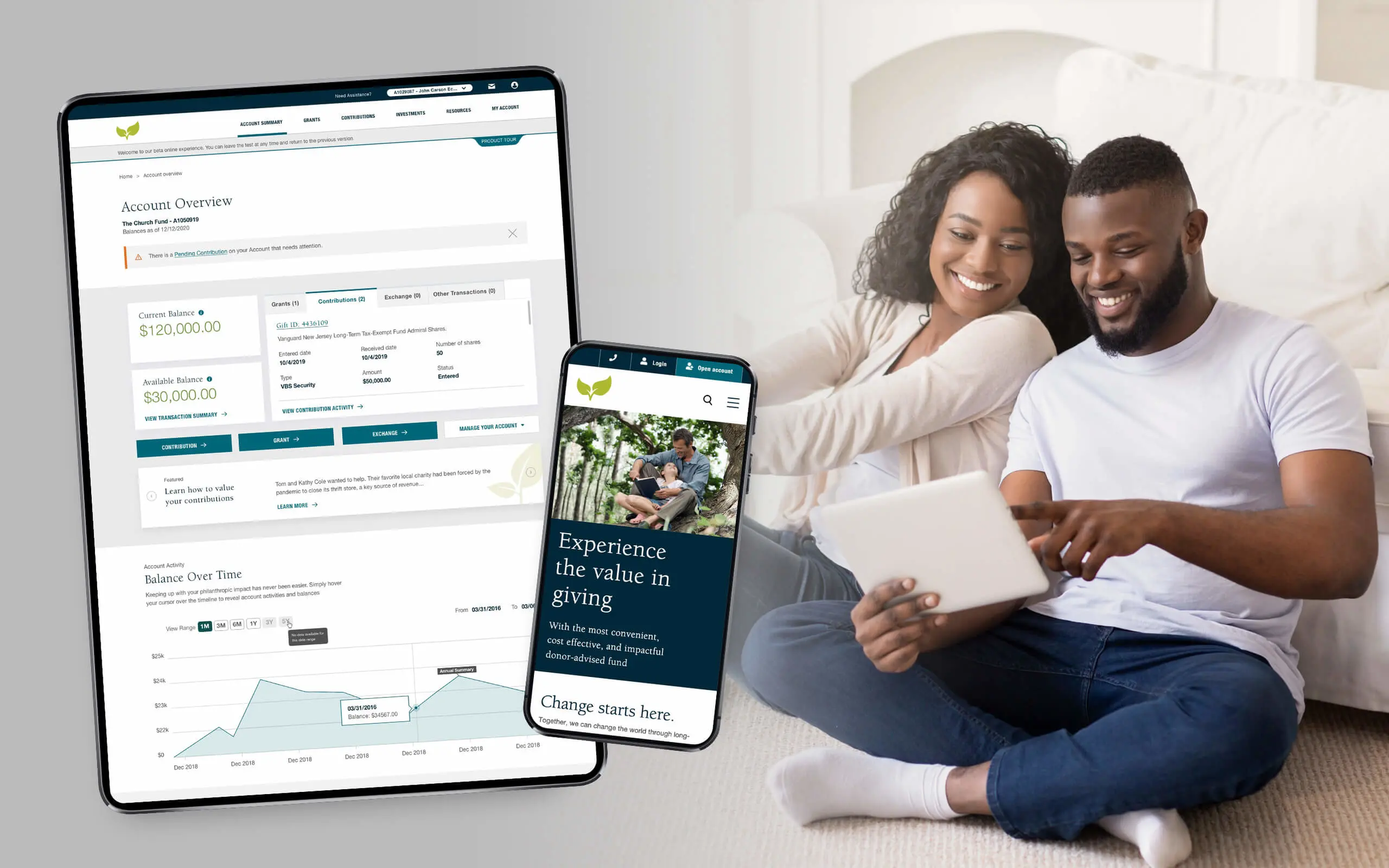
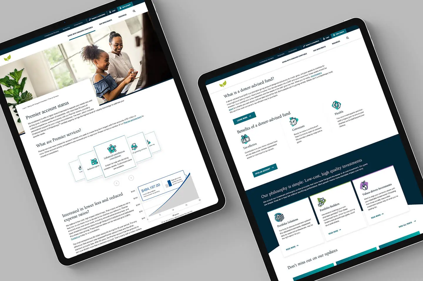
To address a changing customer demographic, Vanguard Charitable, a large US charitable organisation specialising in Donor Advisory Funds, needed to rethink their digital investment process. They required an engaging investment platform that provided an intuitive experience and drove higher contributions while striking a chord with the millennial consumer base.
Category UX Design
Duration 24 weeks
Team 5 members (Donor Portal)
PROJECT TIMELINE
RESEARCH
The research stage involved design audits of the existing structure, competitor analysis to understand the market and primary research that included user interviews.
STRATEGY PLAN
The project was set to be taken up in 3 phases to facilitate the users to adapt to the new features and changes. This would also ease the learning curve.
UX APPROACH
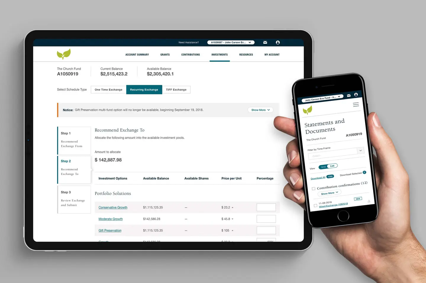
The aim for the donor portal was to make the transactions intuitive & reduce cognitive load by information grouping and restructuring to build a logical flow.
DESIGN PROCESS
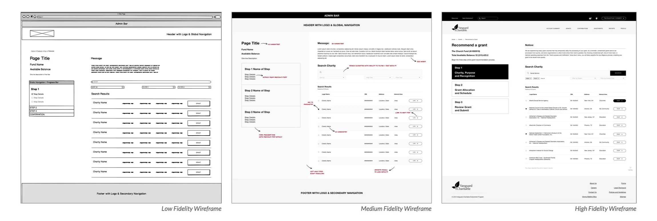
The project was run in the form of design sprints (10 days each). Each sprint would involve building low-fi, mid-fi and high-fi wireframes for selected flows.
PROJECT BRIEF
To build an engaging investment for their online platform: design and implementa fresh digital experience that induces maximum charitable impact, especially among young donors such as millennials as well as onboard legacy clients seamlessly.
The older clients had been using paper forms and other traditional mediums such as faxes and emails to go about their services for the longest time.
RESEARCH: DESIGN AUDITS
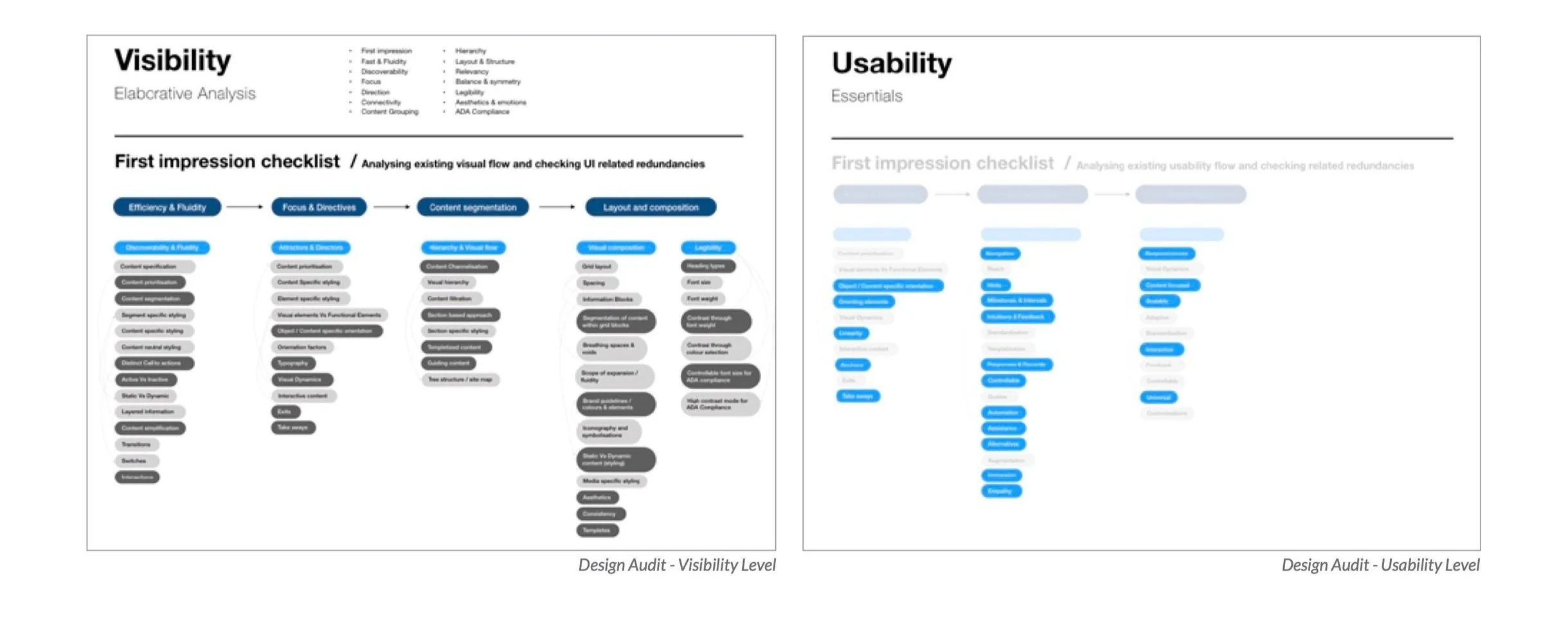
The design team began by conducting an extensive design audit, against the existing application structure, across various aspects such as usability, user interface design, ADA compliance, content segmentation among many others.
A comprehensive competitor study was also done to understand the market positioning of the client and their strengths and weaknesses to build a strong strategy.
RESEARCH: INTERVIEWS
Further more, a few one on one interviews with a select set of donors and stakeholders was conducted to identify the emotional drivers and their challenges behind their investment strategies in the current online platform functioning.
This stage also included mapping the customer journey for millennials who will be adding to the client’s changing demographic, along with the earlier predominant target: middle-aged demographic.
BUILDING THE PRODUCT MAP
Based on the stakeholder inputs, the project was strategised to be released in three phases to ease the learning curve for the existing users to adapt to the paradigm shift and feature additions.
INCREASE CONFIDENCE
Improve visual language and key process flows of public website and donor portals
ENGAGE THE HEART
Simplify transactions and bring focus to giving; addition of completely new features
BRING BALANCE
Facilitate strategy management and easier
contributions
After mapping all the user flows and new features across both the public website and donor portal, the tasks were strategically distributed between the three phases such that it doesn’t overwhelm the existing users, given the demographic who weren’t necessarily digital natives.
UX PRINCIPLES
Before kick-starting the design process, a few principles were laid out, these would lay the foundation of all the experiences that would be imagined. Considering that it was project that involved a lot many stakeholders and was highly collaborative across time-zones, this really helped everyone on the project stay focused.
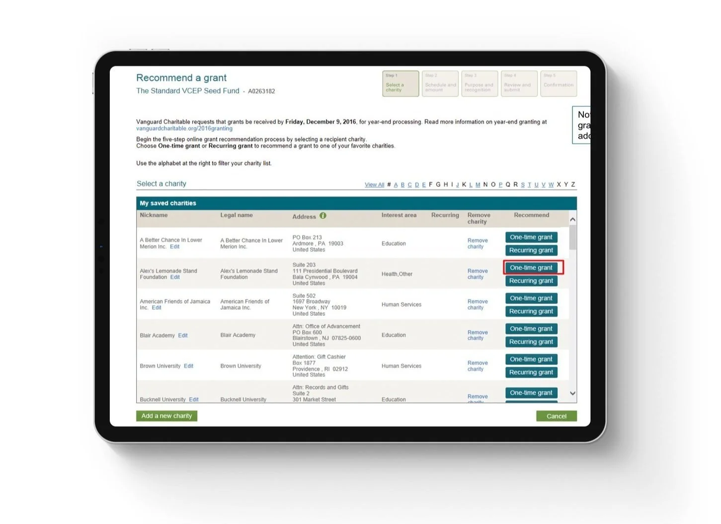
Old Grant Screen with 5 steps (and a review screen)
Information Grouping
In total, there were about 80-90 key screens which were analysed, re-designed and grouped to form a more logical and intuitive user flow enabling a seamless user experience.
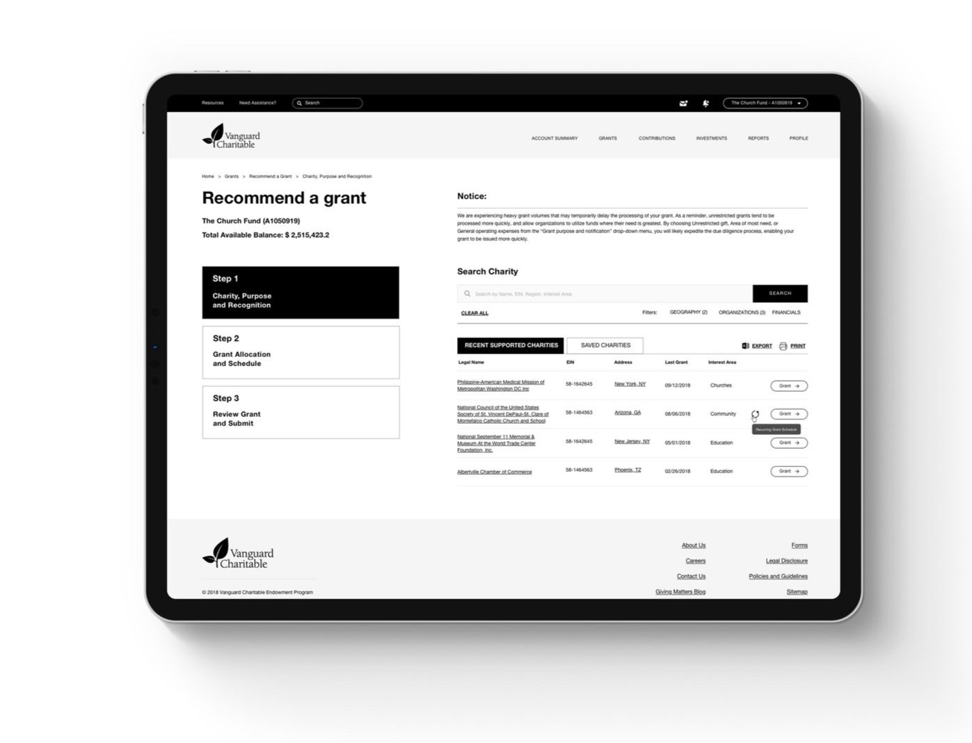
Redesigned Grant Screen reduced to 3 steps
Personalisation
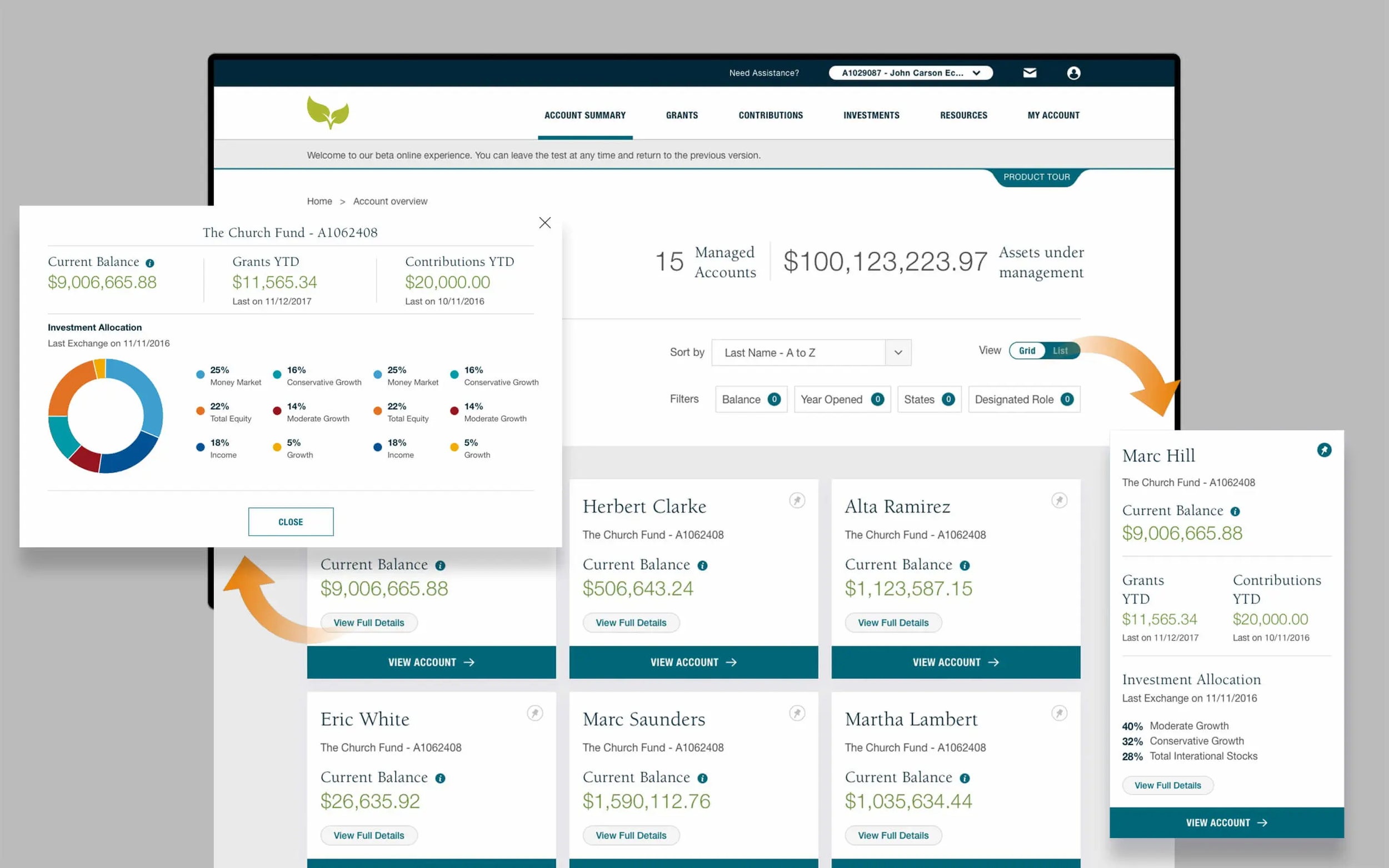
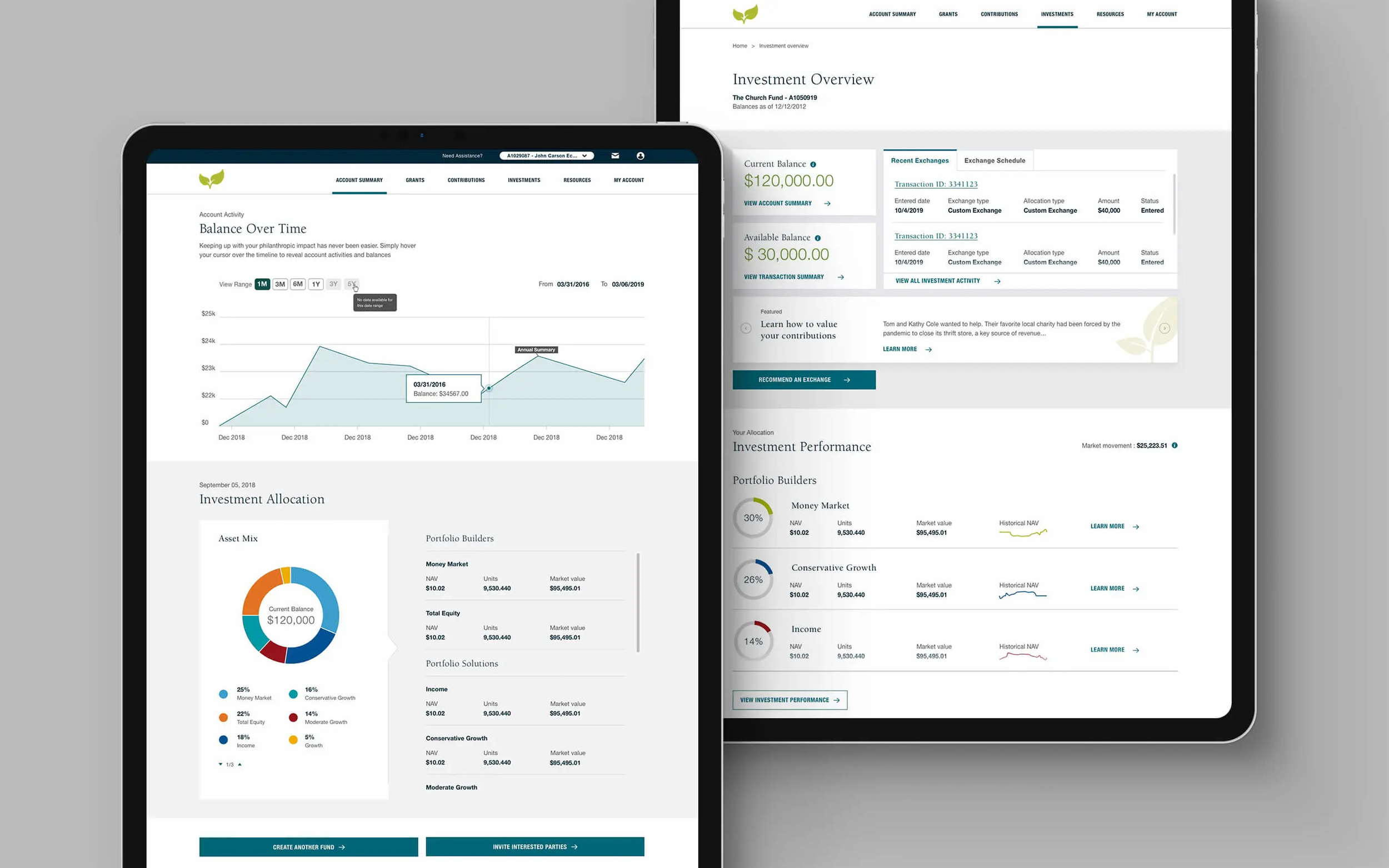
Led the redesign of donor accounts with a comprehensive view of the charities supported and additional insights on causes that helped define their philanthropic missions.
PROCESS: WIREFRAMING
Given the complex site architecture and multiple use flow cases, the project included designing a variety of unique screens in the given time, alongside the ancillary screens.
To achieve this target effeciently in the given time, an agile approach was adopted. The design sprints called for quick ideation and iterations, for which the wireframing process included quick explorations in the low-fidety stage, followed by a slightly refined mid-fidety and finally comprehensive high-fidety wireframes.
The complete set of designed wireframes on the donor portal were later translated into visual design and further developed. This stage also involved working closely with the business analysts to build functional specification documents for each of the user flows and also collaborating with front-end and back-end developers to translate all the well-thought design decisions to seamless functional screens.
SOLUTION HIGHLIGHTS
By mapping the customer journey for millennials, and identifying the emotional drivers behind their investment strategies, the experience was crafted with improved data visualisation and introduction of a radically different visual language that instills confidence, user adoption to the giving process is made faster and more intuitive.
Enhanced Onboarding Experience
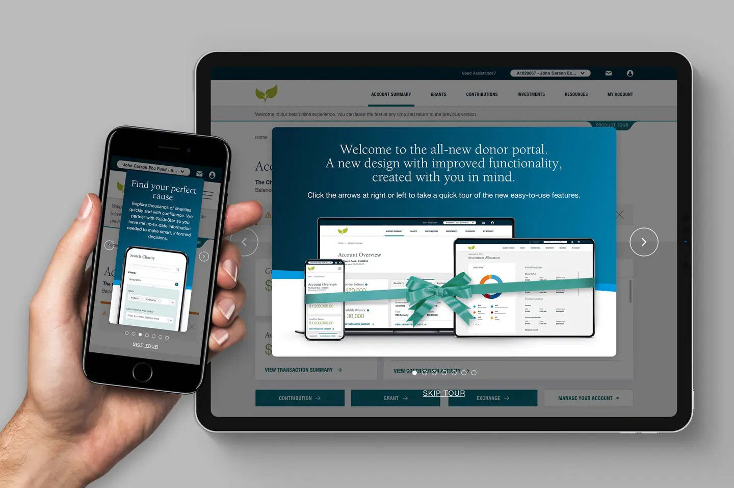
With a seamless onboarding experience, overall product adoption is much smoother. The redefined donor portal login with an improved visual language makes strategic giving easy.
Increasing Donor Confidence
A personalised approach led the redesign of donor accounts with a comprehensive view of the charities supported and additional insights on causes that helped define their philanthropic missions.
Strengthening the investment relationship
Since most stakeholders preferred to be guided by financial advisors for contribution strategies and fund management, a separate consolidated view was created for these advisors where multiple accounts handled could be viewed for better advisory planning.
Optimised Accessibility
All the designs were evaluated to maintain accessibility ensuring longterm compliance to WCAG2.1 standards while elevating the website to an all-time high accessibility score of 94.8 out of 100.
IMPACT

